so what about this one ?

5 Likes
I’m going to stay out of the discussion about 3 vs. 3.1, etc, 'cause I’m too new to have on opinion, and I would probably be wrong.
What I like here:
- Everything coordinates. “Powered By” looks like it was intended to be part of the same logo.
- The light outline around the detail text makes it much more readable.
- An engine that says “counting bananas” on it’s splash screen is not taking itself too seriously. Sounds like a friendly place to be.

Hi @RatKod,
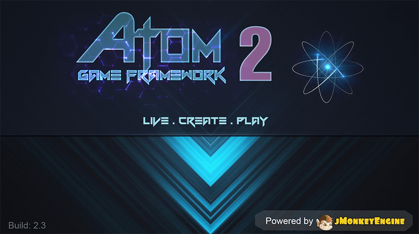
I will also want a nice design for “Powered By” to include in several branding images for our products. For example this screen in the Atom SDK.
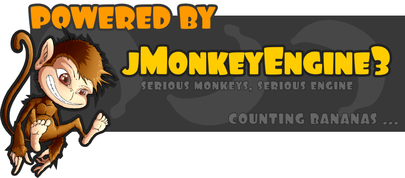
I’m an artist, so I take my chance to add some advices (requests) for the last design above my post, hope this doesn’t sound offensive and stupid in any way:
- The yellow silhouette is not as recognizable compare to its original version, because our monkey is not a recogniziable iconic image yet…
- I’d like to have a small monkey but a little bit less hairy
 The point is hair detail add a lot of distraction to the silhouette. Beside, our monkey look like it only have one leg for example
 - I don’t think the current font and text color fit with the yellow icon at all. Maybe yellow big (main) text in this round chubby font but other texts should have more strength and tidier. In fact, I also don’t think all the “Powered thingy” should include jme3 slogan, because the product may have its own slogan already like my example. The best case it’s to have to version, a simple and small “Powered thingy” and a full splash screen like you are doing right here.
- I think the number “3” also should be highlight. Please refer to the image I post just an example, we’d like to introduce that our product is in second
It’s not easy to design anything I know, especially to represent it in a lot of places. Hope this helpful.
2 Likes
I agree completely re: the silhouette and it hadn’t even occurred to me until you mentioned it. Better to have the actual monkey image there even if it’s filtered to have reduced color set or something. (Though I like it as regular color personally.)
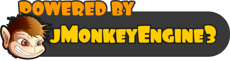
As to your little jME banner at the bottom, is it just me or is the head badly centered? ie: hanging way too low. Else it’s very nice.
I agree that the silhouette isn’t recognizable, plus it’s really look like it’s have only one leg.
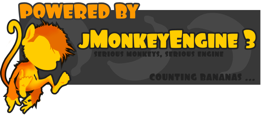
Sooooo what about theses one :
and this smaller :
1 Like
I can see what is being said about the silhouette, but a part of me prefers the monochrome (not that its my decision at all…) I wonder, as a bit of an in-between, what it would look like if you:
- Keep the yellow
- Outline some of the primary features (variable weight line)
- Perhaps also vary the value weight of the fill, while still keeping the yellow?
And now look at all of us cooks piling into the kitchen…
I agree with wanting to keep the simplified colors but needing to make sure that leg can be seen, so uh, here’s a little airbrush action
Also, is there some reason why the monkey has… human feet? This has been bothering me for awhile
2 Likes
You should read some concepts about logos or analyze others.
Your logo is not a log but some big image, there is too much text , a logo is one word text most of the time , and you need something very simple readable in a fraction seconds.
Take a look at Unreal 4 or Unity logos , Havok, Nividia, Crysis or others … they are very simple as possible and their colors or special font conveys some message.
I would say some simple monkey shape without details , and a word like JME3 or JMONKEYENGINE , like Unreal 4 the logo should not contain the version number that is useless as mots people know Epic new engine version is 4.
Some logos examples :
http://lynbrookrobotics.com/uploads/media/2012/08/2011Monkey.jpg
Good luck.
1 Like
By logo this topic means Spash Screen.
I agree with you, the jME3 logo is the monkey itself, like the favicon of this page.
Logo:
http://hub.jmonkeyengine.org/uploads/default/1439/87eeb25a7db82bd4.png
Banner:
http://hub.jmonkeyengine.org/uploads/default/1252/91fcc91347189c84.png
Splash Screen:
http://jme-hub-cdn.jmonkeyengineor.netdna-cdn.com/uploads/default/optimized/2X/4/47cfcbedfb1be1ca15402706eed77c2410ae6ab9_1_690x303.png
4 Likes
Duh… There is a logo already, the point of this is having some image that informs people about the use of jME in the game…
Examples:

(note the version number)

(logo and name)

(another version number)
Didn’t you want to switch to some “artist friendly” engine? Please do. You’re not very constructive around here, no point in telling people what they “should do”.
3 Likes
This is not engines debates , but splash screen that must stay simple
http://i.imgur.com/6r4s1My.gif
A monkey head looks more like a cartoon allusion then 3D engine , well personnaly i would make a monkey shilouette.
Anyway it’s the game engine you use , so it’s to you guys to decide, i can’t help on the subject.
Well, yes you can, since we are a collaborative engine, what about you sending a logo that you made to us? This is the magic behind open sources: We can’t wait for others, if we want something, just go, do it and share!
1 Like
I like this splash screen much better than in its first stage.
It has come a long way.
I also prefer the full monkey. It also fits into the color scheme.
The silhouette is missing recognizability.
When I see the splash screen with silhouette and then look at the small logo,
I cannot recognize anything.
P.S. Can we match the banner and the splash screen?
The banner says “jMonkeyEngine”, whereas the splash screen says “jMonkeyEngine3”
Also the shadow/border could be matched. I think the border would look cleaner.
I am terrible with graphics, so I can’t contribute to this. Sorry, but you don’t want me to open Gimp 