So, I continue to add stuff to Lemur Proto here and there as I can. These new classes probably could have been added to Lemur core but I still wanted to let them incubate. It’s a sort of self-imposed rule at this point for new elements.
I haven’t yet cut a new release with these new components because I hope to be adding some more soon. If there is demand I can do it. In the mean time, as usual, the source can be found here:
https://code.google.com/p/jmonkeyplatform-contributions/source/browse/#svn%2Ftrunk%2FLemur%2Fextensions%2FLemurProto
In progress changelog:
https://code.google.com/p/jmonkeyplatform-contributions/source/browse/trunk/Lemur/extensions/LemurProto/release/LemurProto-changelog.txt
Action
This is similar to javax.swing.Action in that it’s a general way of encapsulating some ‘action’ along with some generic display parameters like name, icon, etc… This can then be poked into buttons and (down the road) toolbars, menus, etc…
Action doSomething = new Action("Do It") {
        public void execute( Button b ) {
            System.out.println( "Do the thing.");
        }
    };
ActionButton
Is just a Button with Action support. Swing puts this all together and I may merge the behavior eventually but in the mean
time ActionButton simply makes sure the Button is setup with the action’s properties (name, icon, etc.).
Button b = new ActionButton(doSomething);
…simple.
Changes to the action will then be automatically reflected in the button itself. So if you change the action’s name then all using buttons will also change… and so on.
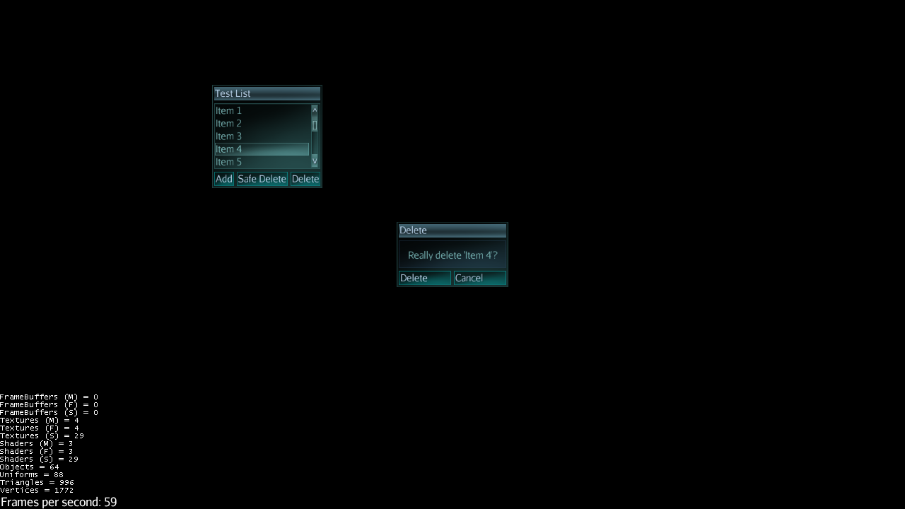
OptionPanel
This is similar to Swing’s JOptionPane though a little simpler. It’s a convenient way of presents some message to the user with a set of options at the bottom. For example, it can be used for error messages with just an “Ok” button or it could be used to present a “Yes”/“No”/“Cancel” style set of options.
Action cancel = new Action("Cancel");
OptionPanel shouldDo = new OptionPanel("Really do it?", doSomething, cancel);
OptionPanelState
It’s almost always the case that you want an OptionPanel to be modal, ie: supersede all other input. OptionPanelState facilitates this and also provides convenient access to pop open an OptionPanel at any time. Simply make sure it’s attached to your state manager and you can grab it where you need it.
getState(OptionPanelState.class).show("Some Title", "Really do it?", doSomething, cancel);
That will present the panel in the guiNode and block all other mouse input except to the option panel. Once the user has clicked one of the options then the panel will close and input will resume.
Next I’ll be setting up some default styling in the glass style which will serve as an example on how to customize it for different styles. Alternately, OptionPanel provides raw access to any of its internal elements and they can be tweaked directly as needed.
Similar to Swing’s JOptionPane, you can pre-create OptionPanels in advance and just pop them open when needed. The OptionPanelState supports this too:
getState(OptionPanelState.class).show(shouldDo);
Also, OptionPanel provides access to its internal center Container that holds the message text. So just like Swing’s JOptionPane you could add additional GUI elements as needed for some simple input like capture a text field or slider value or whatever.