So I’ve been tinkering with a new 3-dimensional box art graphic for the soon-to-be released Beta 1 (seriously, it’s so close you could smell it). After a couple attempts, I’m looking at some okay graphics, but nothing outstanding:
So far all the feedback I’ve got after proudly showing off the fruits of my labor has been:
Kirill:
It's easy to do box art.
So firstly, I'd greatly appreciate your feedback. Second, and more importantly, if anyone more artistically inclined would like to try their hand at some box art and download buttons, we would love to see it!
I’ve compiled a couple recommended fonts. We should be okay with “for personal use only” but would prefer a properly free font, i.e. creative-commons, free for commercial use.
I think the last one looks pretty good, but I think the monkey is kind of hidden on the box side. Maybe we could have only its face (as it happens on the site banner on the top) besides the “Beta 1” at bottom?
But, I am not a designer myself, so this could be a dumb suggestion as well.
I also like the third version very much already… Its like jME3 is this very reactive agent making your games the awesome sauce ^^ Maybe just tinting the new monkey a bit green and making him “jump out of the poison” (just put him on top) would be cool.
I would suggest to make shadows under “jMonkey Engine SDK” text more transparent and less. The shadows blur the text. Well, black text and black big shadows…
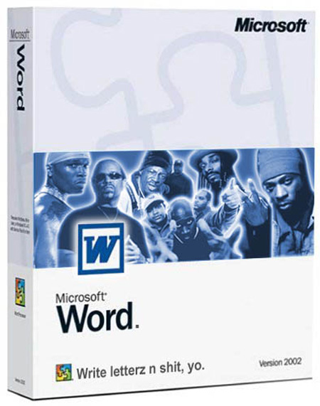
I like the last one best. The only thing I’d consider changing is the font and the font colour specifically. I hate to use this as an example but if you look at the box art for MS Word or similar the font is a bit more understated. Here’s the first example I could find:
 http://i.imgur.com/pvCCw.png
 http://i.imgur.com/yBMkS.png
 http://i.imgur.com/agVNL.png
 http://i.imgur.com/Lnh6I.png