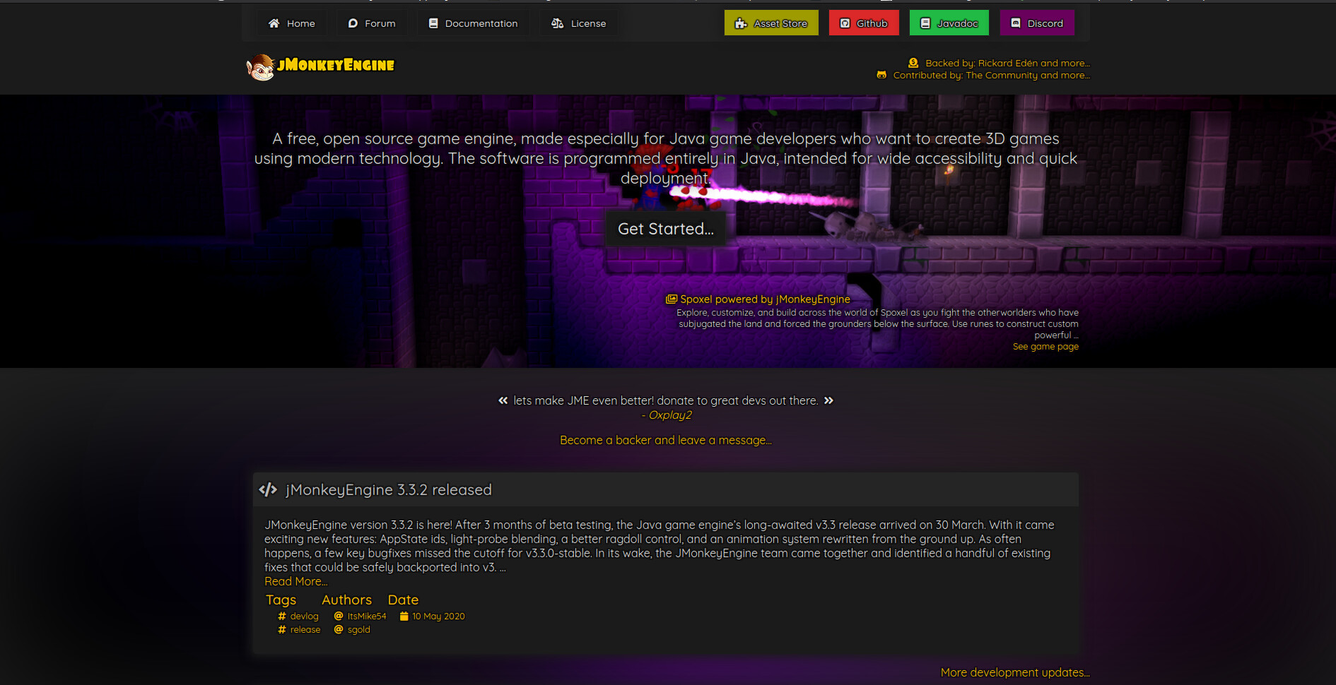
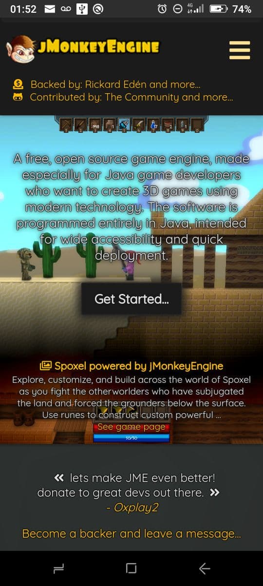
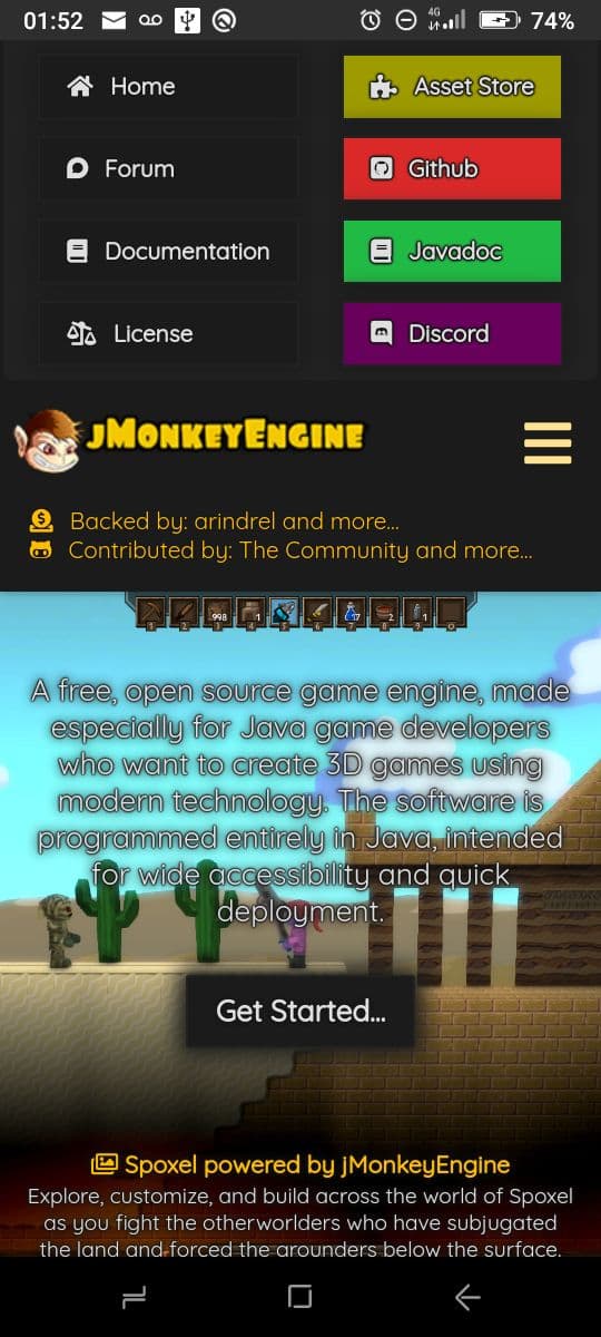
One random backer and github contributor are displayed on the header
Author infos (name,bio etc) are obtained directly from github (no more author.md pages)
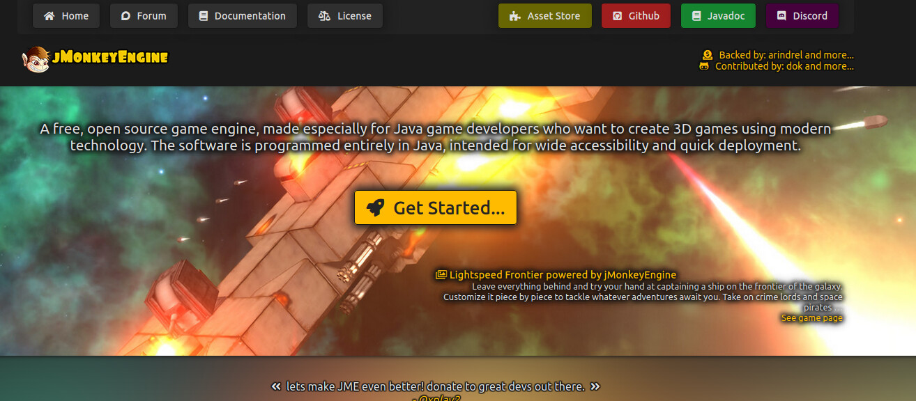
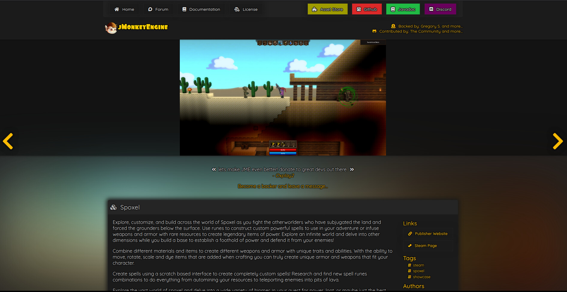
One random image from the showcase is displayed in the background of the top banner with a link to the project page
One random backer message (left on our opencollective page) is displayed under the top banner
Categories do not exist anymore, only tags are used to group posts
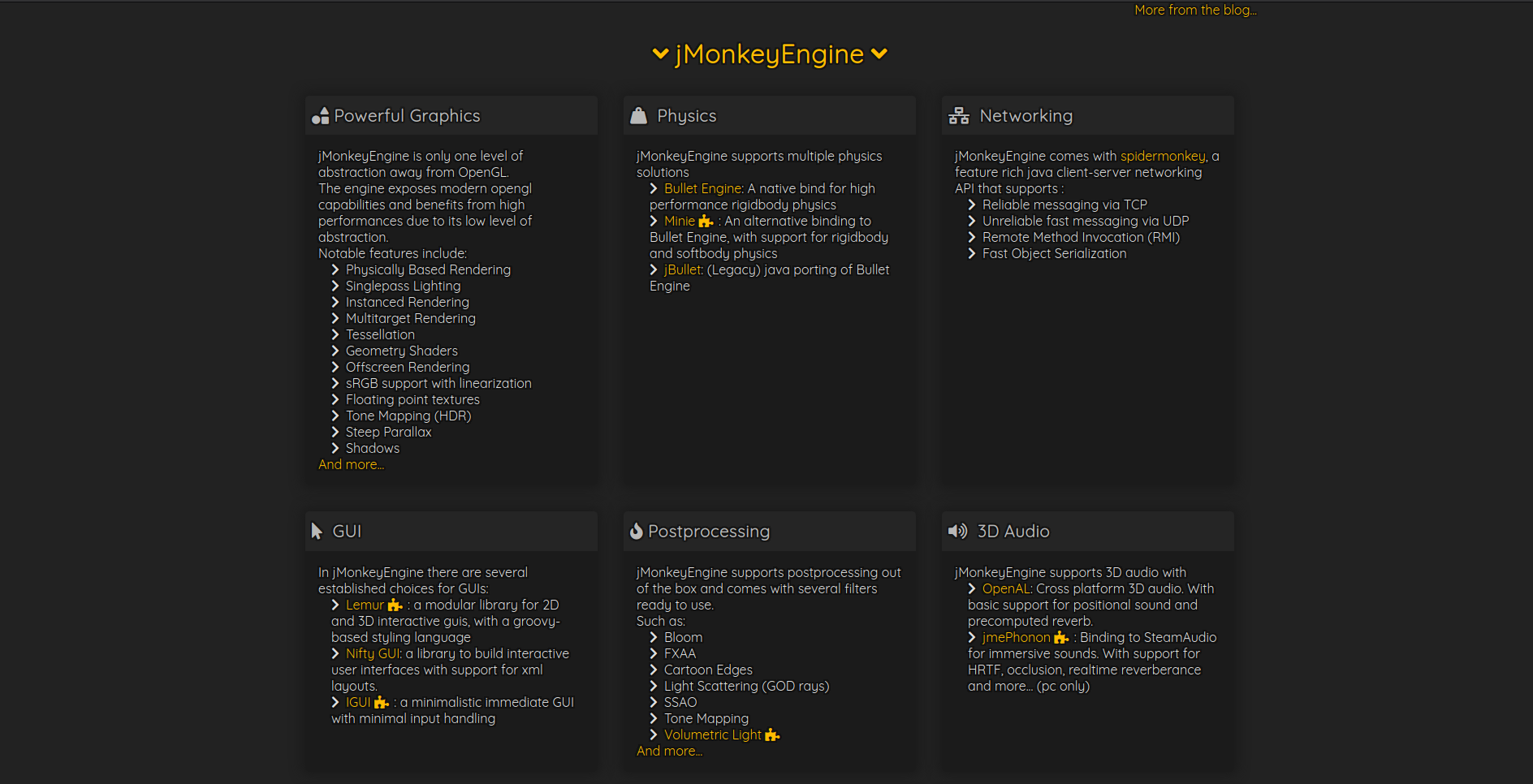
The Features section has been redone, and it now features also links to mature third party libraries from the community (marked with a little puzzle icon for addon)
Probably comments using the hub embed code (still looking into this)
The header and buttons menu look wrong to me as they are a black band and square buttons.
The black buttons for the home, documentation, forum, license should not be the same color as the background. Black is just not a good color for just about anything outside of text to me. Color makes things pop, black is just unimaginative.
The blue, purple, and gold colors at the start of pages, etc. blended with dark edges are awesome. Having it degenerate into the total dark monkey theme, not so much.
Not a fan of dark monkey, so I am biased. Looks real nice up to that dark part though. Just keeping the slightest blend of dark would be a winner imo.
Great work ,love the general layout & the gradients , but text seems a little bit blurry on light backgrounds ( those cyan backgrounds otherwise on dark ones ,they make a good impression)
I’ve also exported the colors into css3 variables on the :root element, so in case anyone wants, it is possible to experiment with the palette from the dev console.
Suggestion:
The “Get Started” page could have a “Next” button at the bottom, phasing the reader directly into a sort of guided lesson path - and the button could take you directly to jMonkeyEngine 3 Tutorial (1) - Hello SimpleApplication :: jMonkeyEngine Docs (which then at the bottom already has “previous” and “next” buttons) perhaps. Just a thought.
I am not sure if the Donation button should stand out too much, since we have already several references to donations around the website. However to make it stand out a little bit more from the other buttons, i “inverted” it, by making the foreground dark and the background light
@RiccardoBlb
I see that some of the feature boxes have some user contributed libraries in them.
Would it be OK if my Monkey-Netty library was included under networking?
Sure. @oxplay2 already suggested that on discord, but i wasn’t sure about the maturity of the library.
If you think it is stable enough already, then i will add it there.
Also i plan to update this list often in the future as new libraries get released.
Yes, it has been very stable in my projects, and I believe that @oxplay2 has been using it.
I am actively maintaining it, so anyone does find issues with it, or has features/improvement suggestions, I am more than happy to help make any required changes.


 ( those cyan backgrounds otherwise on dark ones ,they make a good impression)