Tamarin VR : different colors between desktop view and vr view

(follow up of this post, copy pasted here for SEO considerations)

The colors in VR are different from the colors in “regular” mode. In VR, all colors seems brighter, and the shadows are darker.
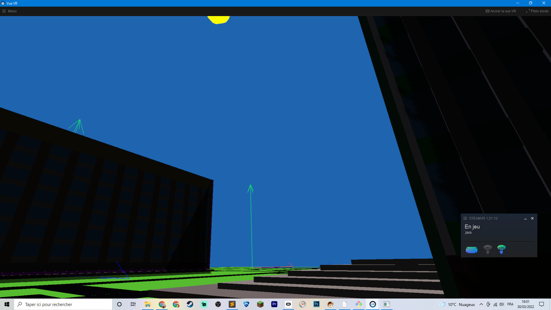
Below : VR View :

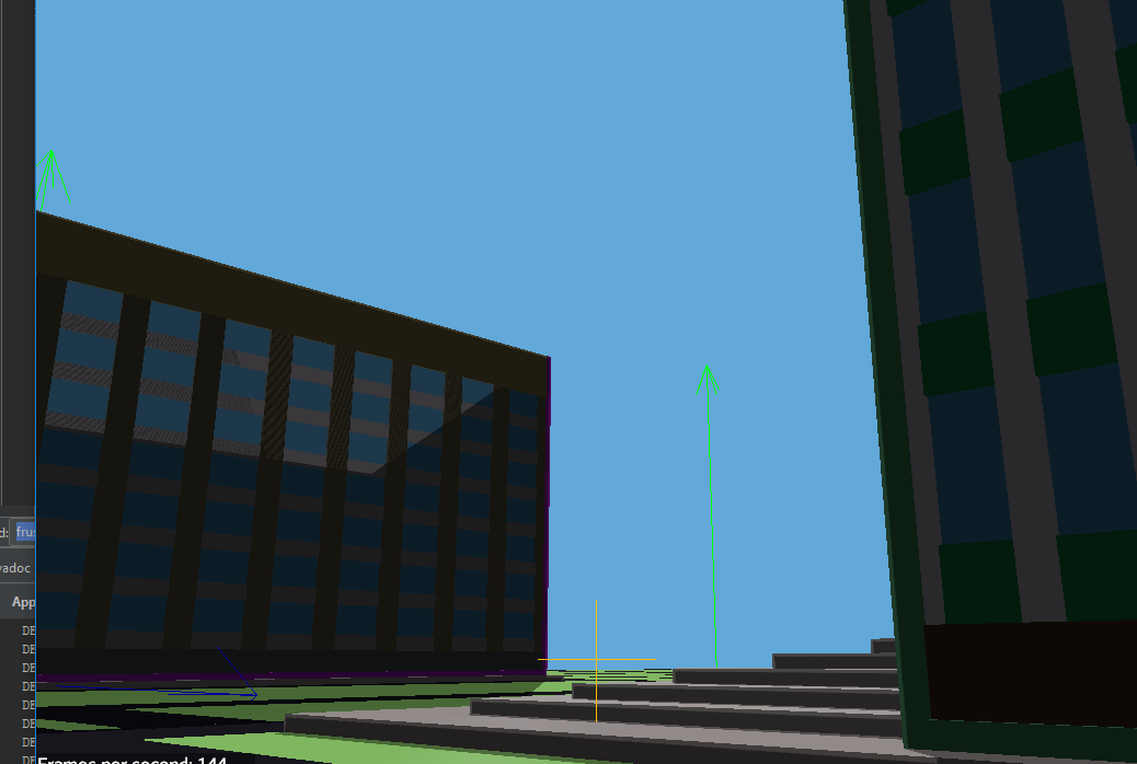
Below : Regular view (FPS, or non-vr) of the same scene with the sun in approx. the same position

For example, the sky color. It’s hardcoded, for now, in a fragment shader like so

31.0f/255.0f,100.0f/255.0f,179.0f/255.0f

So for the Sky, with a color picker tool (photoshop), we can see that the VR view has the closest color.

For the ground, it’s defined in java like so new Color(97, 213, 54). Again, the VR has the closest color.

The ground material is defined like so :

// in our case ambientColor is "new Color(97, 213, 54)" ; it's passed as an argument
Material mat = new Material(assetManager, "Common/MatDefs/Light/Lighting.j3md");
mat.setBoolean("UseMaterialColors", true);
mat.setColor("Ambient", ambientColor);
mat.setColor("Specular", ColorRGBA.White);
mat.setColor("Diffuse", ambientColor);
mat.setFloat("Shininess", 128.0f);

And there are two lights :

sunLight = new DirectionalLight();
sunLight.setColor(ColorRGBA.White);
sunLight.setDirection(new Vector3f(-.5f, -.5f, -.5f).normalizeLocal());

AmbientLight ambientLight = new AmbientLight();
ambientLight.setColor(ColorRGBA.White.mult(0.1f));

Both VR and non-VR render the same scene, of course.

So … I wonder which view renders the colors correctly. And also, except shaders/materials/lighting, I don’t have a slightest clue what in my code could affect the colors in such a way.

Also, both launchers have these settings :

settings.setGammaCorrection(true);
settings.setBitsPerPixel(1);
settings.setDepthBits(32);
settings.setSamples(4);

When launching TamarinTestBed, I noticed there is the same kind of difference in color between the jmonkey mirror view and the steam mirror view.

In this screenshot the full screen application is the jmonkey renderer, while the one at the bottom right corner is the steam mirror view. The colors there are much more saturated. Which seems to be my exact problem.

The first thing that comes to my mind is gamma correction. If I remember correctly, desktop jme uses it by default, while I’m not sure whether it’s implemented or not for VR.

2 Likes

I think you’re right. If I turn gamma correction off (which is the opposite of what we want) they both look identical (the desktop view looks dark like the steamVr view)

    settings.setGammaCorrection(false);

That doesn’t really help but it at least explains it. The fix will be in JME’s code I think

Indeed the problem originates with gamma.

So I’ve been reading :

Before 3.2.0, Gamma correction was done via a post processor filter. Not anymore, now it’s with settings.setGamma that, if I understand correctly, is a feature some GPU have “out of the box”. But this feature doesn’t exists on mobile, and so it appears, on Oculus Quest 2.

So for now, the solution are :

  • resurrect GammaCorrectionFilter and using it only on VR
  • disable gamma correction alltogether and re-work all colors and lighting
  • using another post processor filter ; I’ve tinkered with ContrastAdjustementFilter and ToneMappingFilter, but not good results

For my case, I want both VR and non-VR to have the same render, so I’ve picked solution 1°, and it works great … for now. Maybe it will impact frame rate.

1 Like

Note: GammaCorrectionFilter is not the same as setting gamma=true. Despite the confusing name, they do completely different things.

GammaCorrectionFilter is really just remapping bad lighting to a new gamma curve… but the lighting was already done in srgb space and so is incorrect. No real way to fix it… but you can make it brighter.

gamma = true converts srgb textures (images made from photoshop, etc.) into linear space so that lighting calculations can be done accurately. These are converted back to srgb for display.

So if you really want your views to match with hardware that does not support gamma=true (which I think is weird) then you will have to use gamma=false and then if you want things brighter, add the constrast adjustment filter (Which is what the old gamma filter was actually doing).

The lighting will be “wrong” but at least it will match.

(Note: I say the lighting is wrong and you will get all the experts who can tell you the exact very good reasons why that’s true… but in my Mythruna I actually prefer the wrong lighting.)

1 Like

I played with ContrastAdjustementFilter but I did not get good results. Same with ToneMapping.

From what I read here and there, settings.setGammaCorrection(true); has no effect on some platforms (mobile and quest2). No idea why, I’m far from being acquainted with such niche issues.

(Note: I say the lighting is wrong and you will get all the experts who can tell you the exact very good reasons why that’s true… but in my Mythruna I actually prefer the wrong lighting.)

Could not agree more. At some point, the way a scene renders is more a question of feeling, especially in a game.

Yeah, I feel like gamma=false has a more painterly quality which is what I’m going for in Mythruna, anyway. In my ideal world, every screen cap would look like a D&D illustration (just with lots of blocky terrain).