I’m doing some work on the layout of the Material Editor, and would like some feedback from the community before pushing it.
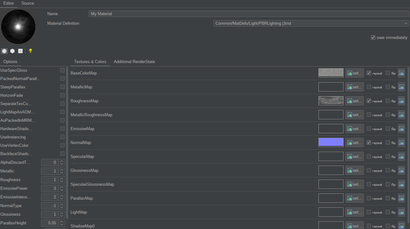
Here’s what it looks like today:
The main thing I dislike is that the “Textures & Colors” tab expands horizontally so much that it’s sometimes difficult to know which texture you’re editing.
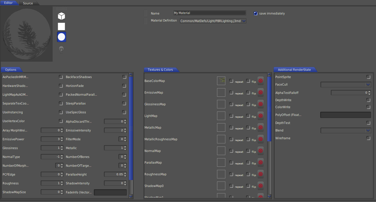
Here’s the wip:
Textures tab is now smaller, and “Additional Renderstate” has been brought to front (because it could). Each tab can expand and retract to some extent. Preview is also bigger.
There’s still a lot of unused space. I should probably make “Name” and “Material Definition” boxes bigger again.
Are there any features you think are missing in the material editor today?
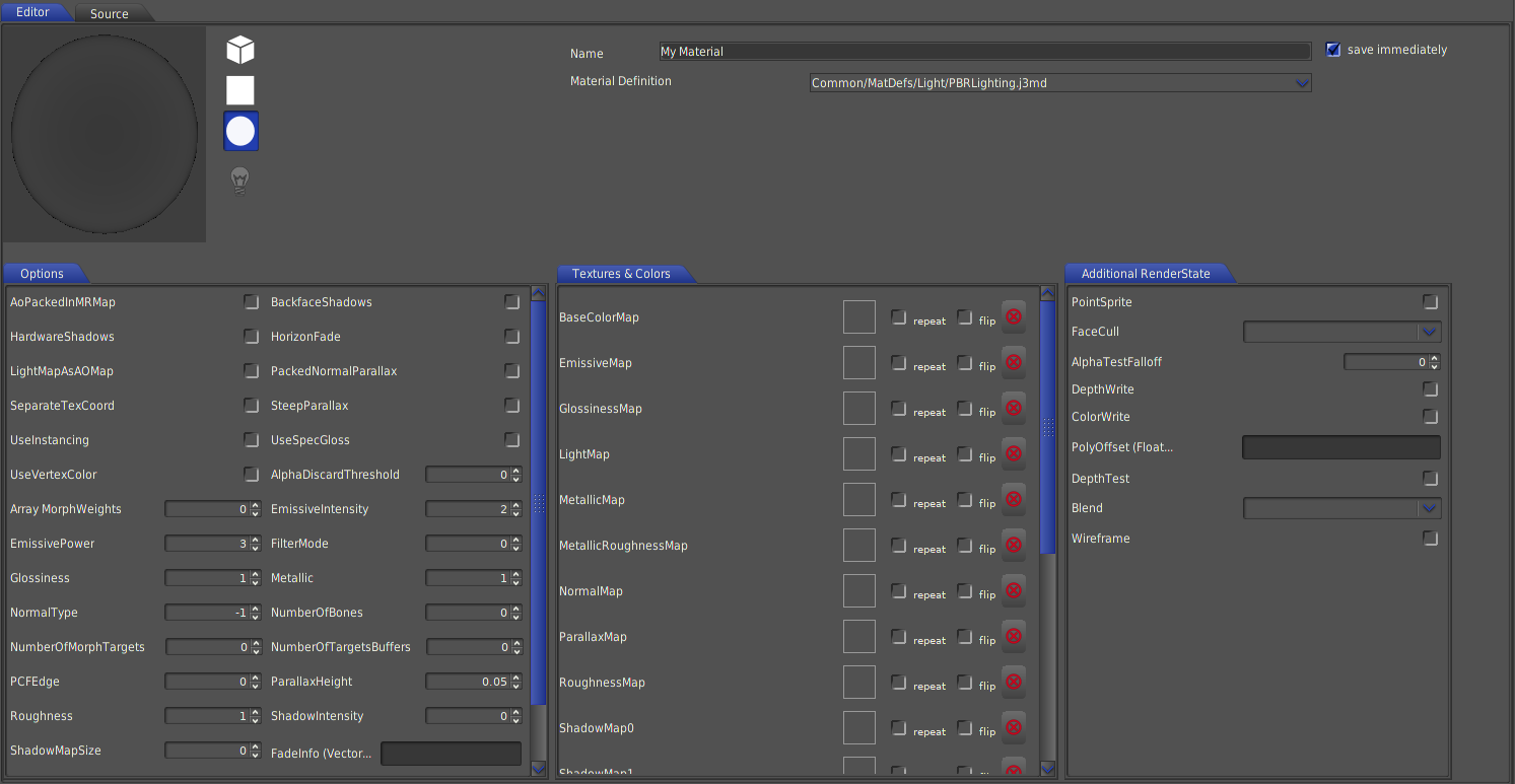
Edit: The LaF differs between my dev sdk and the released one. Top one is default in the next release, I think.
Did you consider the option to put the preview on the right, instead of adding a new tab ?
This would have at the same time reduced the horizontal size of the tab, increased the preview size, and reduced lost place
I didn’t consider that, but it’s a cool idea, IF it needs to be bigger.
I can think of a couple of reasons why not:
We’d lose the “additional renderstate” tab, which I think contains options important enough to be in front.
In case you’re editing in split view, with the scenecomposer on the side (yes, you can do that in the SDK), you’d have “two” large 3d views and again would have to compromise on editing options.
It would be nice with a bit more responsive / flexible design, but I don’t have the energy required to try to implement that in the gui designer.
I welcome some much needed changes to the material editor, bravo!
The new design does look like an improvement, but I’d have a couple complaints from my time with the material editor, mostly while trying to write shaders. I’ve been writing Unity shaders quite a bit lately and here are my observations about what I would change in the jme material editor from a perspective of someone writing shaders:
I applaud the expanded Options pane, there was literally 0 reason for the textures to take up so much space. I am not however too happy with the fact that most of the property names still get cut off now that there’s 2 columns of options there. Also a purely aestethical comment, but why are float and int selection boxes of different widths? It ends up looking rather janky.
Preview could really do with being able to turn the preview object around. Since it’s currently static, it’s rather useless for anything that involves lighting or normal manipulation. While I’m writing down my wishlist, a way to import a custom model for preview would be awesome as well.
The preview as it is, is rather useless for shader development, as it doesn’t have live refresh. If I change my shader file on disk, the preview should refresh, so I don’t need to reopen the material window every time I do a small shader tweak. Lack of this functionality sadly prevents me from undocking the material editor, putting it somewhere else in the UI and just start coding.
Please, give the material definition dropdown box some more space to breathe. In the current WIP it’s rather short and the j3md paths get long. Like really long when you have a project solely for experimenting with shaders.